.jpg?width=1707&height=2560&name=envisions-brain-of-materials-haptic-optic-by-iwan-pol-and-sanne-kaal-4-scaled%20(1).jpg "envisions-brain-of-materials-haptic-optic-by-iwan-pol-and-sanne-kaal-4")
A more subtle, yet equally sustainable choice, can be found in the RE-YSTONE material board from Dekodur. Composed of recycled natural waste materials from the sugar and paper industry, it poses as a conscious option for interior applications. The board’s natural composition is reflected in its visual appearance, with a homogeneous bark-like texture that plays with light. Therefore, the material’s surface evokes a familiar atmosphere reminiscent of natural phenomena to indoor applications.
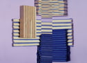
When moving away from the static material spectrum, diverse examples of hapticity can be found in the world of textiles. Exemplary is the Highfield range from Kvadrat, which features a double-layered tactile pattern. A checkered base-layer – formed by the weaving and duo-tone color combination – and a bold heat-printed pattern of varying organic circles. The friction between these organic and geometric textures takes up a central spot in the material’s appearance and – once again – overshadows the influence of color.

The only way to find out is by putting a wide range of material samples – with varying colors, textures, and finishes – to the test. By translating them to casted grey concrete, we get an understanding of how texture and shape influence our perception.
The Luxury composite panel from Foresso is reminiscent of a cobblestone road with the top layer sliced off. A sustainable mixture of wood, sawmill waste, cement, lime waste, resin, and pigment, is applied by hand to a plywood base to achieve the material’s striking appearance. The combination of a flat top layer with organic grooves creates an interplay of texture enhancing shadows. The distinct surface predominates its appearance, independent from its color coating.

A less contrasting, but equally impressive take on the idea of double-layered tactile patterns can be found in the Front range of De Ploeg. The gridded baselayer is complemented by a bigger grid pattern that enhances the tactility and graphic qualities of its carrier. The qualities of color can be applied to reinforce texture combinations, but are non-essential to the textile’s general appearance.
Overall, the above materials illustrate the interplay between a material’s texture and color, and how the absence of the latter doesn’t necessarily detract from a material’s hapticity. On the contrary, the lack of color can help to highlight other characteristics and thus enhance a surface’s tactile appearance.
inspired by
Foresso – composite panel
Innofusor – acoustic panels, rimpi
Buxkin – ripped, recycled leather
Deepmello Leather – rhabarberleder
Verseidag – glassfiber mesh coated
Staudigel – alpha subli lite
Dekodur – reystone
Atn Vinyl – python
De Ploeg – front
Kvadrat – highfield
Longbarn – basalt low